A Design Pass on Sherwin Travels

I wanted to know whether AI design tools could help with a real design pass, not a blank-page mockup.
So I used Sherwin Travels as the test case. It is my family travel blog, and it was already in decent shape: warm palette, editorial type, good photography, responsive layout. That made it a better test than a broken site. Bad design is easy to improve. The harder question is whether a good-but-not-quite-there site can become clearer, more distinctive, and more useful without turning into churn.
This is the short version of the pass: what changed, what improved, and what I would still watch out for.
The Starting Point
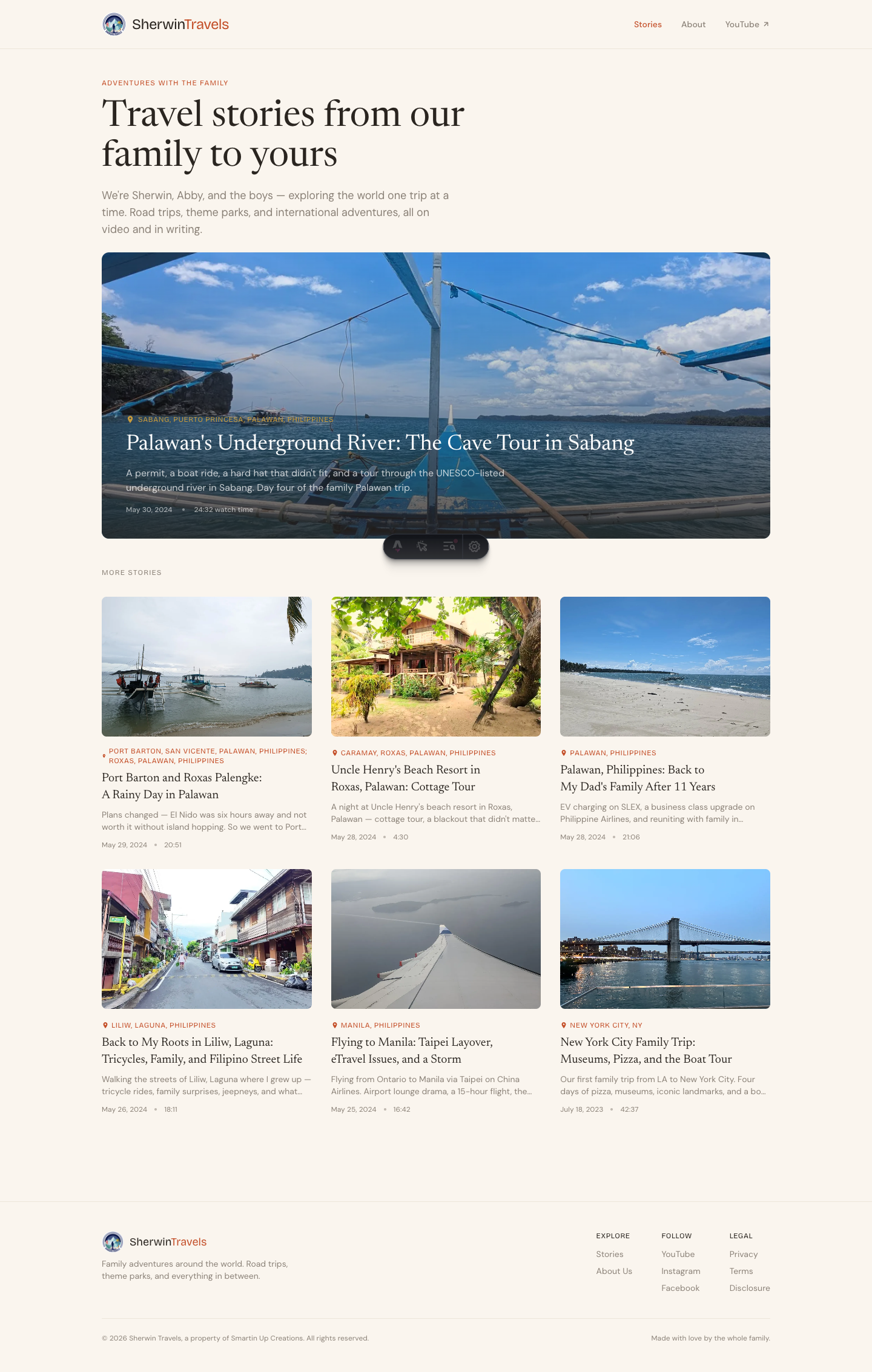
Sherwin Travels already had a direction. Cream background, ink-brown text, terracotta accents, big travel photography, and a serif-heavy editorial feel.
That part worked.
What felt weaker was the hierarchy. The homepage headline was large, but not quite a masthead. Section labels were easy to miss. Post cards had similar visual weight. The post page hero showed the photo first, then placed the title below it, which was readable but safe. The site looked pleasant, but it did not yet feel very specific.
The design brief I had in my head was simple:
Longreads-meets-family-travel-journal. Warm, quiet authority. Images do narrative work. Typography carries more weight than decoration. No neon, no glass, no generic AI gradient.
Pass One: Make It Feel Editorial
The first pass was mostly craft.
I made the homepage headline feel more like a masthead, strengthened section labels with ornamental hairlines, gave post card titles more weight, replaced bullet separators with em-dashes, and moved the post title into the hero image with a darker scrim behind it.
The post page was the biggest change. Before, the hero image and title were two separate moments. After, they became one feature-style entrance.
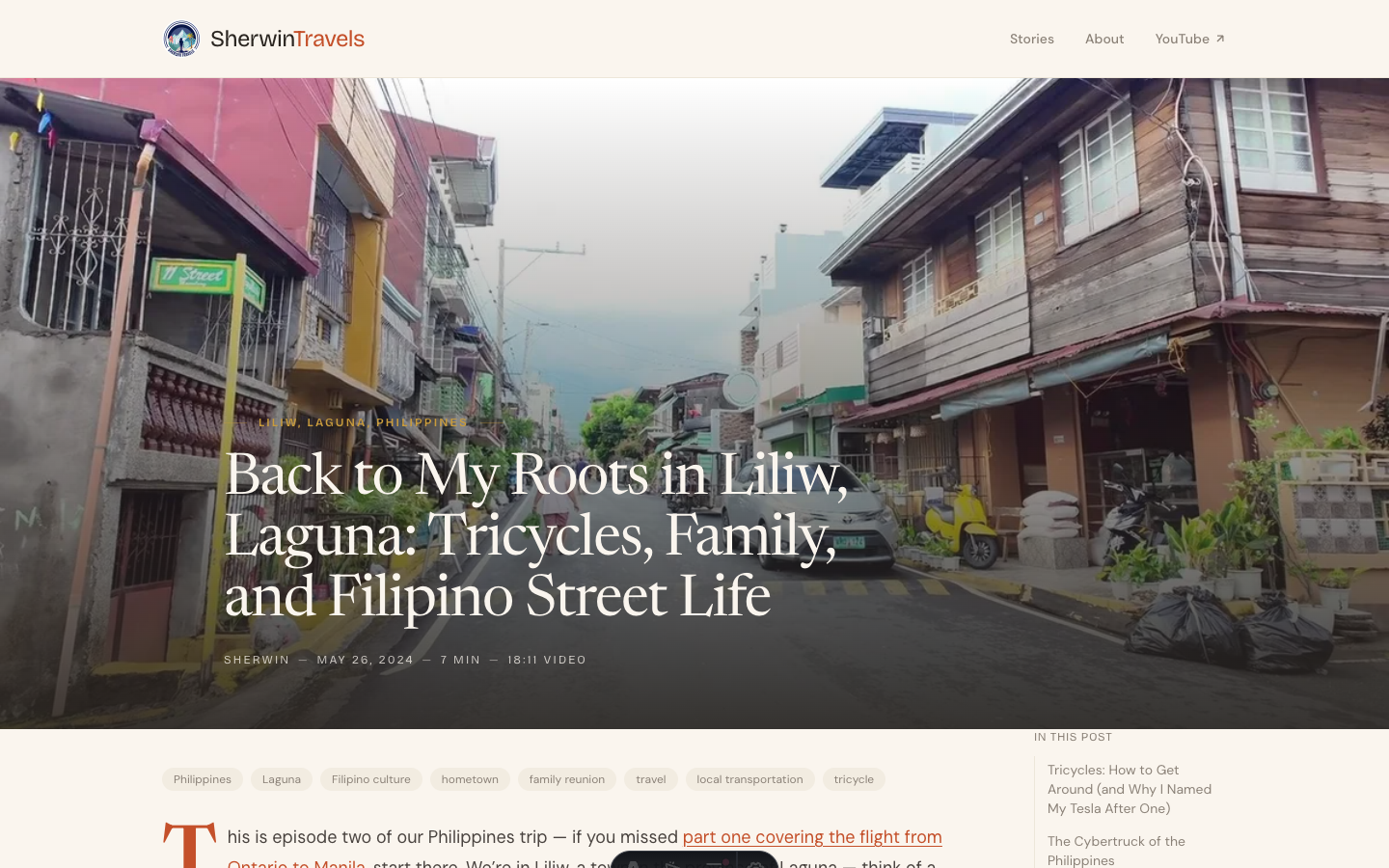
I also added a drop cap to the first paragraph. It is a small thing, but on a story site, small editorial signals matter. They tell the reader this is meant to be read as a feature, not just a CMS entry.
What improved:
- The homepage had more authority.
- The post page felt more like a story.
- Metadata looked intentional instead of default.
- The design felt more crafted without changing the underlying structure.
What did not change enough:
- The site still looked like a nice warm editorial blog.
- It did not yet have a travel-specific visual idea that belonged only to Sherwin Travels.
That distinction matters. Craft is good, but craft is easy to imitate. The site needed something more ownable.
Pass Two: Add Something Only a Travel Site Would Have
The second pass was where the site started to feel more specific.
I added two travel-native elements:
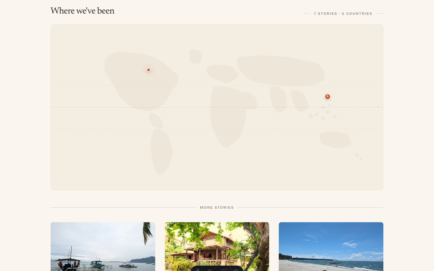
- A homepage map showing where the stories happened.
- Passport-style stamps on individual posts.
The map was not meant to be Google Maps. I wanted it to feel editorial, more like a travel spread than a utility map. The pins came from post coordinates, so the map was connected to the actual content instead of being decorative.
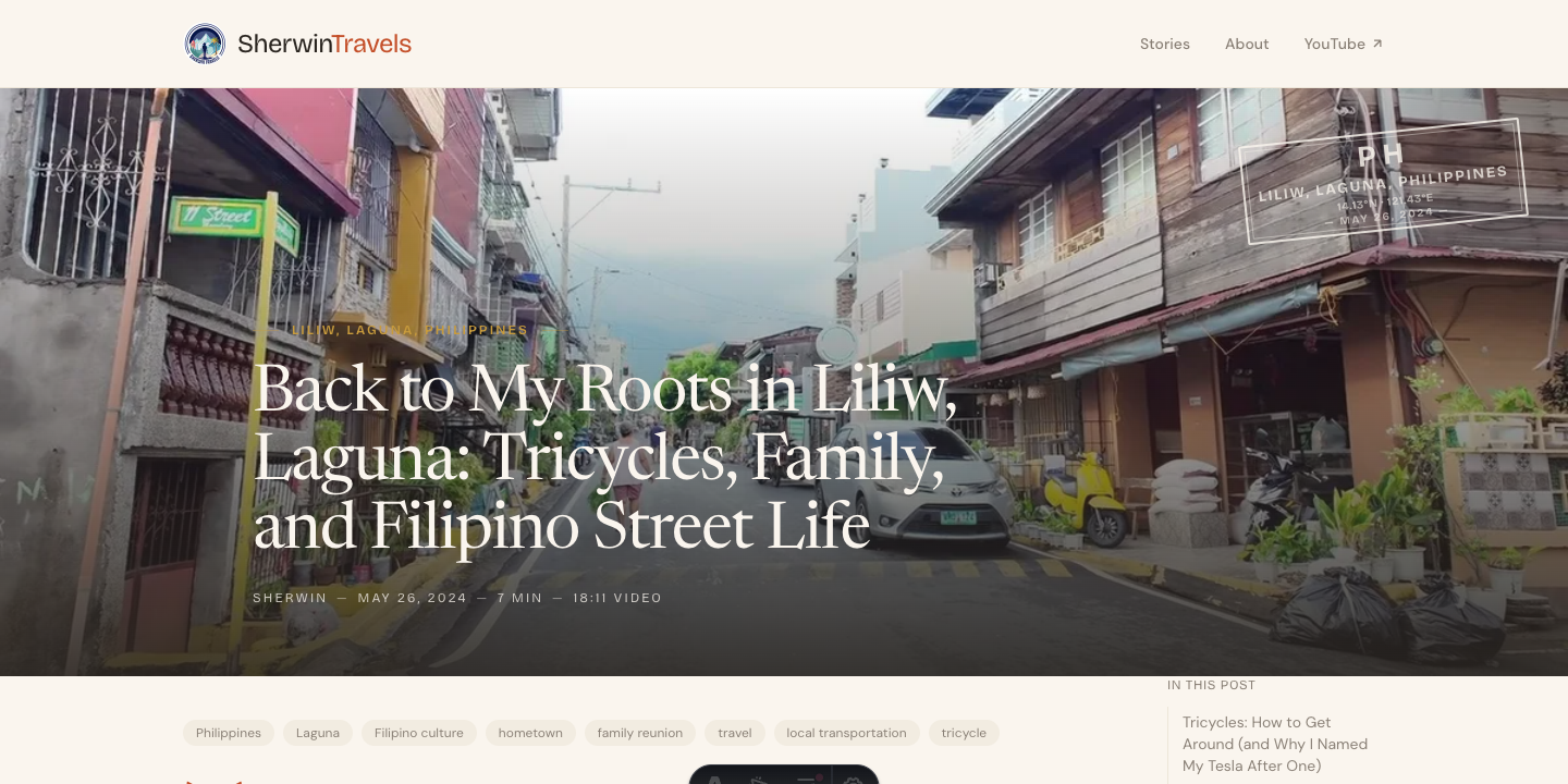
The passport stamp gave each post a sense of place: country code, location, coordinates, and date. It is a small visual device, but it says “travel log” immediately.
This is where the site started to feel owned.
A visitor could land on the homepage and understand the site faster: this is a family travel journal, these are real places, and the stories are tied to locations. A visitor could open a post and immediately see where the story happened.
That was the real improvement. Not just prettier UI. Clearer identity.
Pass Three: Fix the Rough Edges
Once the bigger ideas were in place, the next pass was less exciting but just as important.
The Philippines pins overlapped because several posts were geographically close. I added clustering so nearby posts became one larger pin with a count. The map became easier to use and more honest about the shape of the trip.
The passport stamp needed a subtle backdrop because it washed out on bright hero images. I added a dark radial fade behind the stamp area, quiet enough to disappear on dark images but strong enough to keep the stamp readable.
The map also needed a mobile adjustment. A wide 2:1 map looks good on desktop, but on a phone it becomes too short to read. Giving it a taller mobile aspect ratio made it usable.
These were not glamorous changes. They came from looking at the rendered page and noticing where the idea broke down.
That is the part AI tools do not replace. They can help you move fast, but someone still has to look at the result and decide whether it works.
Pass Four: Make the Content Structure Match the Trips
The last meaningful change was not visual polish. It was content structure.
Several posts belonged to the same Philippines trip, but a reader landing on one post would not know it was part of a larger series. So I added series metadata and a SeriesNav component.
At the bottom of a post, the reader can now see the whole trip arc, the current episode, and the next or previous story.
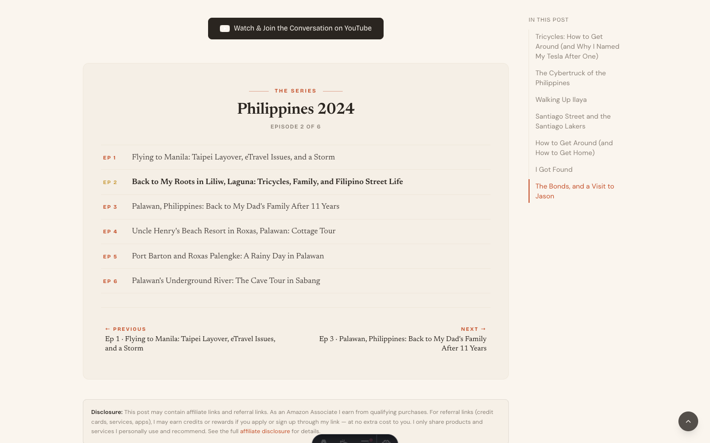
That made the travel content work more like a journey instead of a folder of unrelated posts.
I also changed the homepage featured card. Once the post hero used an image-overlay treatment, the homepage feature card felt repetitive. So I moved it to a split editorial layout: image on one side, text panel on the other.
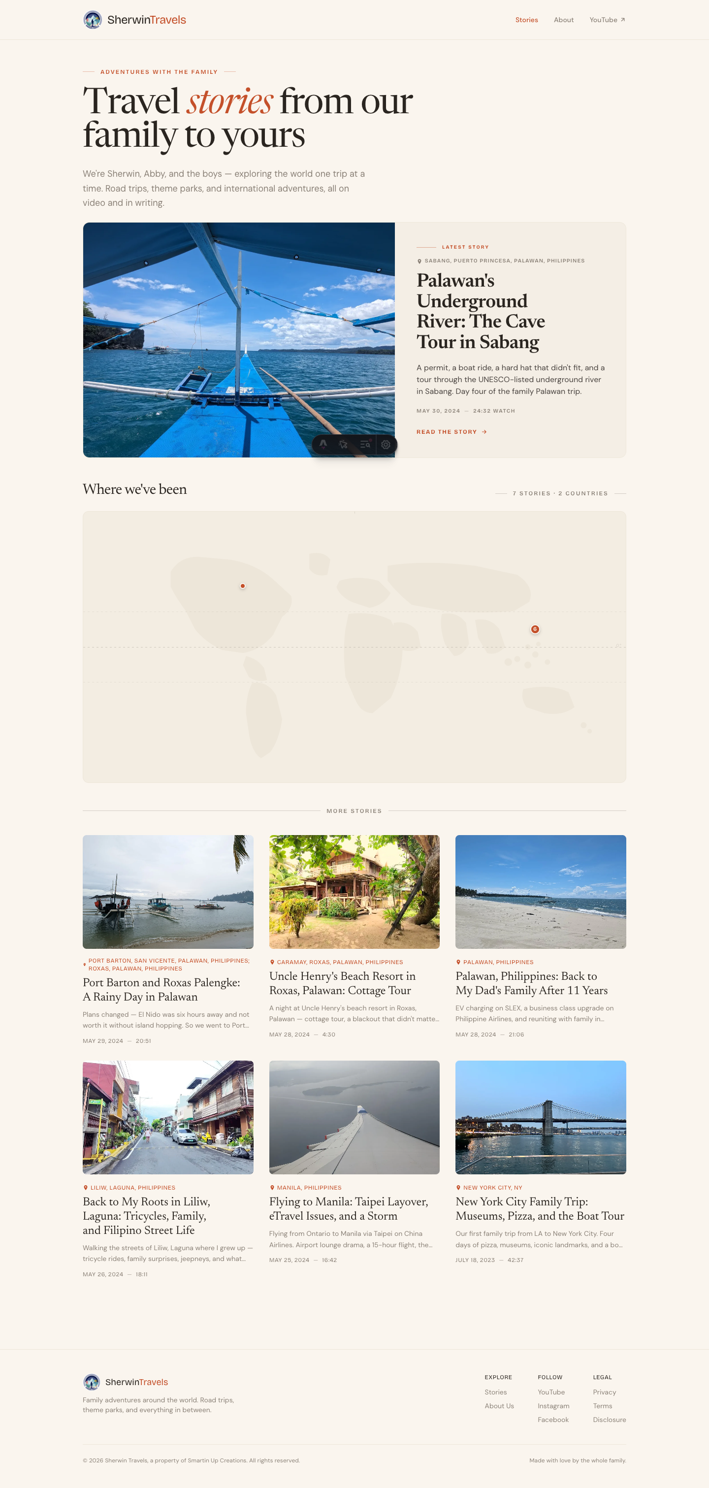
That gave the homepage more rhythm: masthead, featured story, map, post grid.
What Actually Helped
The useful part was not that AI tools magically invented a better site.
They did not.
The useful part was speed. Once I knew what I wanted, the tools helped turn the decisions into working code quickly. I could try a map, a stamp, a series component, a featured-card redesign, then look at the result and keep or reject the idea.
The strongest improvements still came from human judgment:
- A travel blog should show where the stories happened.
- A trip with multiple posts should feel like a series.
- A homepage should not stack two hero treatments back to back.
- A stamp that looks nice but washes out on bright photos is not done.
- A map that looks good on desktop but collapses on mobile is not done.
Those are not prompt-engineering problems. They are site-shape decisions.
What I Would Still Do Next
The site is better, but not finished.
I would still consider a homepage module for the full Philippines 2024 series, a dedicated map page, and a photo-essay post type for trips where the images matter more than the prose.
I would also keep watching the post hero treatment. The magazine-style overlay works for strong travel stories, but it may be too loud for quieter posts. A per-post heroStyle option would probably be the right long-term answer.
The Takeaway
AI design tools are good at helping with craft. They can move faster than I can when the direction is clear.
But they do not invent distinctiveness on their own.
The map did not come from a tool. The passport stamp did not come from a tool. The series treatment came from knowing the site and realizing the content had trip arcs.
That is the lesson I would carry into the next design pass: use AI to reduce the distance between an idea and the rendered page, but do not outsource the question that matters most:
What could only this site do?
Leave a comment
Comments are moderated, so it may take a bit before yours appears. Your email is never published.