Local Pharmacy Website Redesign: What We Fixed
I recently audited and rebuilt the website for North D Pharmacy, an independent community pharmacy. This is the breakdown: what was wrong, what we did, and why the decisions were made.
If you’re an independent business owner reading this and your website still has the same template you built in 2018, this post is for you.
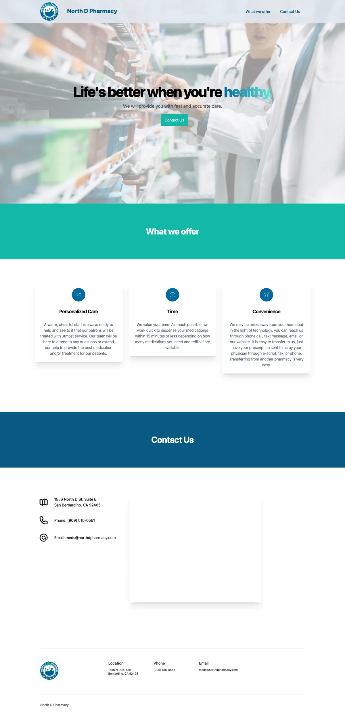
The before: a working pharmacy with a non-working website
North D Pharmacy is a real, active business. They fill prescriptions, deliver to patients’ homes, accept Medi-Cal, serve long-term care facilities, and have a bilingual staff. In person, they’re doing everything right.
Online? Different story.
What the data said
The site was getting roughly 496 users over 12 months, about 40 per month. Sounds okay until you look deeper:
- Average engagement time: 16 seconds. That’s not long enough to find a phone number, read an address, or decide to call. The national benchmark for a local business site is 2–3 minutes.
- ~30% of that traffic was bots. The
800×600screen resolution appearing as the second most common size is a classic bot fingerprint. Real local visitors were more like 25–30 per month. The new setup includes bot filtering at the infrastructure level. - Zero events tracked. No phone click, no directions click, no email click. Their primary conversion (someone calling the pharmacy) was completely invisible to analytics.
What Lighthouse said
Lighthouse is Google’s built-in browser tool that audits a website across four categories and gives each a score out of 100. Running it against the live site told the rest of the story:
| Score | Category |
|---|---|
| 73 | Performance |
| 80 | Accessibility |
| 100 | Best Practices |
| 91 | SEO |
91 on SEO sounds good. Until you look at what was missing.
The main failure: no meta description. That means Google was writing its own snippet for every search result impression. But the deeper SEO problem wasn’t Lighthouse-measurable. There was no structured data, no schema to tell Google: this is a pharmacy, here are its hours, here’s the address, here’s the phone number. That’s what generates the rich result panel in local search. Without it, you’re invisible in “pharmacy near me” queries.
The LCP problem
LCP (Largest Contentful Paint) was 6.3 seconds on mobile. That’s the score for how long a visitor waits before the main visible content appears. The target is 2.5s. At 6.3s, most people on a sidewalk Googling “pharmacy near me” will close the tab before the page loads.
The culprit: an unoptimized, unpreloaded hero image with no explicit dimensions. The browser couldn’t reserve space for it and had to wait for the full download before painting the page. The rebuild replaces it with a preloaded, properly sized WebP with explicit dimensions — LCP on mobile is now well under 2.5s.
The thing that broke my heart a little
The Google Maps embed, the only tool on the page for getting directions, wasn’t rendering. On both desktop and mobile, the section where the map should be was a large blank white box. The embed URL was from 2023 and stopped working. Right now, on the live site, anyone trying to get directions from the website can’t.
Everything else
- Phone number buried at the bottom, not visible without scrolling
- No hours of operation anywhere on the page (I found them on Healthgrades)
- Two H1 elements on the same page
aria-label="": an empty aria label, which is worse than having none- Animation library loaded but never initialized; dead code on every page load
- Two separate map iframes for desktop and mobile instead of one responsive embed
- No meta description, no sitemap, no robots.txt, no canonical
The rebuild
Build decision: keep it static
The site was originally a static HTML file with a CSS build pipeline. Perfectly reasonable for 2023, but not structured for maintainability or SEO.
I rebuilt it as a small static site with hand-written CSS. Reasons:
- Clean static output keeps the site fast and simple to host.
- Minimal JavaScript by default. The new site ships only what’s intentional: analytics and the language switcher.
- SEO primitives are built in: title, description, canonical, OG tags, and structured data all live in one place and stay consistent across every page.
- If they ever want to add a blog, a “new hours” page, or a team page, it’s one content file.
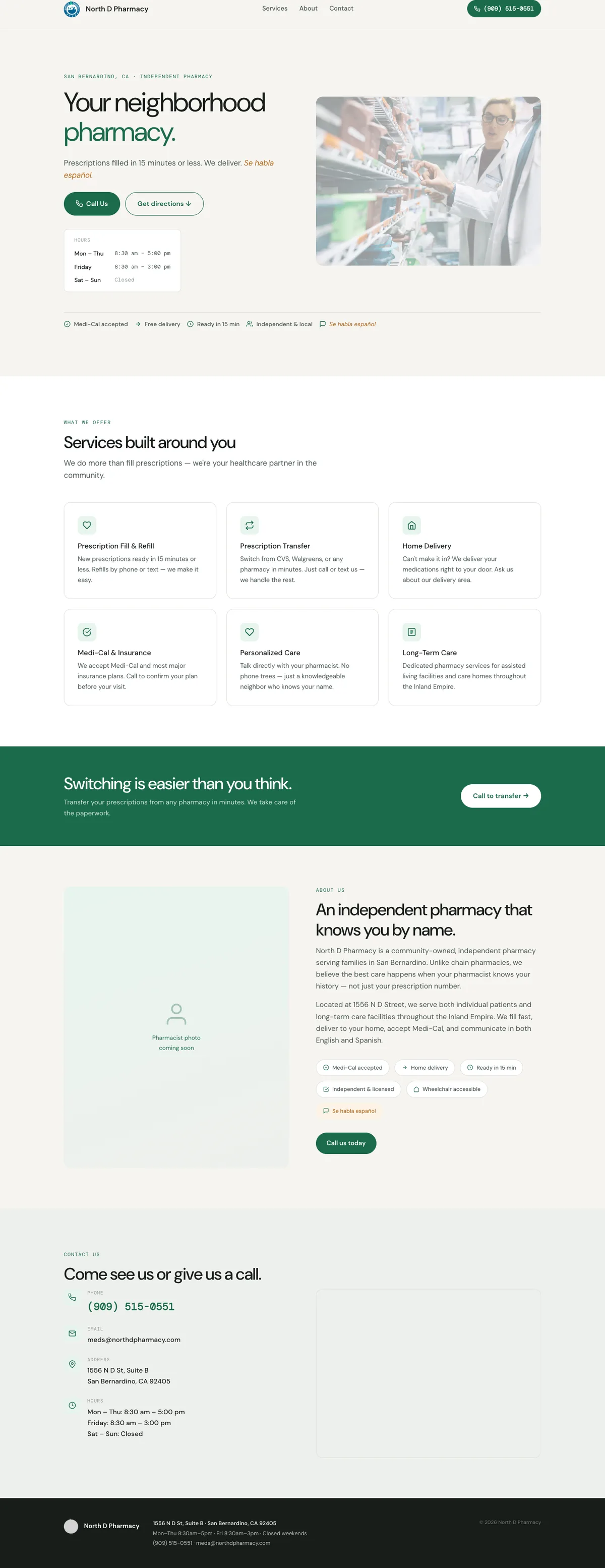
Design direction: warm and local, not chain-cold
The original palette was chain-pharmacy navy and teal, colors that read more like CVS than a neighborhood pharmacy. The typography was the system default; no webfont loaded at all.
The redesign uses:
- Logo blue (
#1672A4) as the primary accent, matched from the pharmacy’s own logo. Nothing like CVS’s red or Walgreens’s lighter corporate blue. - Warm off-white base (
#F6F4F0) instead of clinical white. The slight warmth reads as approachable without going clinical. - DM Sans, a humanist sans with a wide x-height, readable at small sizes on a 5-year-old Android screen in California sunlight.
- DM Mono for hours and meta labels, the precise voice.
- Amber for the “Se habla español” label. Warm, distinct, never alarming.
What the new site does differently
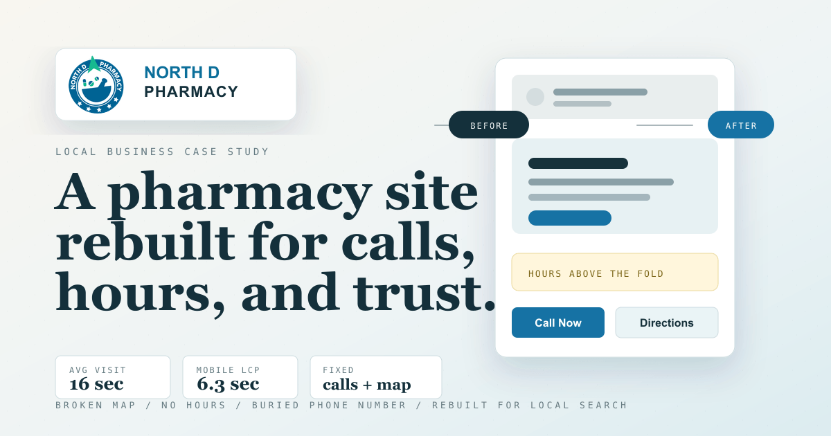
1. Phone number in the header, always visible. The single highest-impact change. On the old site, you had to scroll to the bottom of the page to find the phone number. On the new site, it’s a call button in the sticky header, visible on every scroll position, on every device.
2. Hours above the fold. The most-searched piece of information about a pharmacy. The old site had no hours anywhere. The new site shows them in the hero, before the first scroll.
3. Structured data for local search. Every page now includes a full Pharmacy schema block: name, address, geo coordinates, opening hours, phone, email, payment methods, and description. This is what makes Google’s local business panel work and what puts you in “pharmacy near me” results.
4. Real services, not vague pillars. The old site had three cards: “Personalized Care,” “Time,” and “Convenience.” These are not services. They’re marketing adjectives. The new site lists what they actually do: prescription fill and refill, transfers, delivery, Medi-Cal, LTC services, personalized pharmacist care.
5. A transfer CTA. “Switch from CVS or Walgreens in minutes.” This is how independent pharmacies grow: by making it easy to leave a chain. The old site had no such call to action.
6. Analytics for every conversion. Phone clicks, email clicks, directions clicks, transfer CTA clicks are all tracked. Now when the owners ask whether the website is working, there’s a real answer.
7. One responsive map, not two broken ones. A single map embed that’s accessible, properly responsive, and works on every device. No duplicate desktop and mobile versions that can fall out of sync.
8. Accessibility baseline.
- One
<h1>on the page - Language declared on the HTML element
- Proper landmark structure
- Decorative icons hidden from screen readers
- Meaningful labels on interactive elements
- WCAG AA contrast throughout
9. Full bilingual Spanish version. The pharmacy serves a Spanish-speaking community and says so. “Se habla español” appears in the hero, the trust bar, and the about section. The rebuild backs that up: there’s a complete Spanish version of the site with every piece of copy translated, not just the headline. A dual pill EN | ES toggle lives in the sticky header so any visitor can switch at any point. The site remembers the choice, so a returning Spanish-speaking visitor lands on the right version automatically. Both versions are in the sitemap with the correct cross-references for Google.
10. Reviews CTA. Independent pharmacies live or die on word of mouth. The rebuild adds a dedicated section with one-tap links to leave a Google review and a Yelp review. Those same listings are wired into the structured data, so reviews feed into search visibility, not just reputation.
Before and after
The screenshots are full-page captures, but the story is really in the first viewport: what a patient can see before deciding whether to call, visit, or leave.
The desktop difference is mostly about clarity. The old version looked like a pharmacy template. The new version answers the practical questions first: are they open, where are they, what do they do, and how do I call?


Mobile matters most here. A local pharmacy website is not a brochure people leisurely read at a desk. It is often something someone opens quickly because they need a phone number, directions, hours, or a transfer option.
What’s still in progress
A few things are pending client input before the site goes live:
- Expanded services: immunizations? Compounding? The full list gets more service-term impressions in Google.
- Insurance list: Medi-Cal confirmed, but there are likely others.
- Spanish translation approval: the full bilingual version is built and live in staging, but pharmacy staff needs to review and sign off on the translated copy before it goes live.
- Final review and approval: the client needs to walk through the complete site and give sign-off before launch.
The takeaway for independent business owners
You don’t need a $10,000 website. You need:
- Your hours, above the fold. (One line. That’s it.)
- Your phone number in the header. (Not at the bottom. The header.)
- A map that actually works.
- Structured data that tells Google who you are.
- Copy that names your actual services, not marketing adjectives.
Every independent pharmacy, dentist, hardware store, and restaurant that skips these is handing business to the chains that don’t.
This is an ongoing project by Smartin Up Creations. If you run a local business and your website needs work, get in touch.
Leave a comment
Comments are moderated, so it may take a bit before yours appears. Your email is never published.